
How’s the Weather? Scary!
Canada’s weather service hopes you’ll think so

Canada’s federal weather service just got a makeover. As of late November, the WeatherCAN app from the also-rebranded “Environment Canada and Climate Change” features colour-coded alerts to warn Canadians about bad weather.
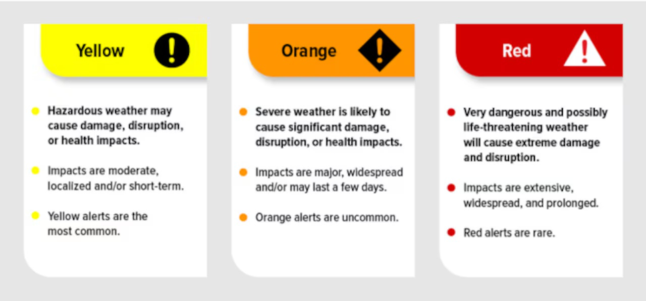
The alerts range from yellow to red. Yellow, the most common, indicate that “hazardous weather may cause damage, disruption, or health impacts.” However, the “impacts are moderate, localized, and/or short-term.”
The “uncommon” orange alerts indicate that “severe weather is likely to cause significant damage, disruption, or health impacts. Impacts are major, widespread, and/or may last a few days.”
Red alerts, the worst, highlight “very dangerous and possibly life-threatening weather,” that “will cause extreme damage and disruption. Impacts are extensive, widespread, and prolonged.”
Here’s some reasons for my skepticism about this colourful government initiative.
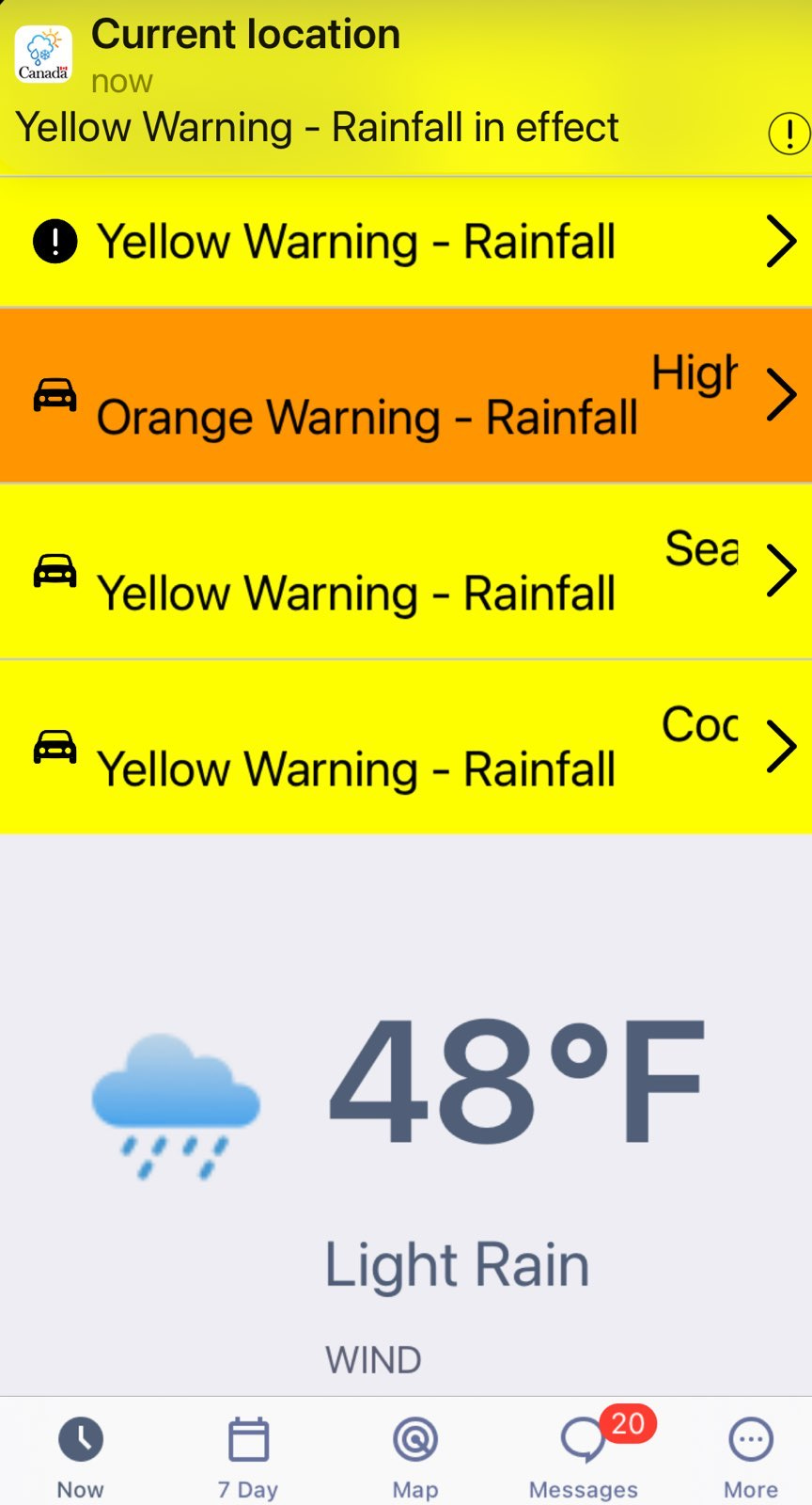
Below are two pictures taken on the morning of Dec. 15, both across the space of minutes. On the left is the weather alert for the city, and the other is the photo of the scene near my neighbourhood.
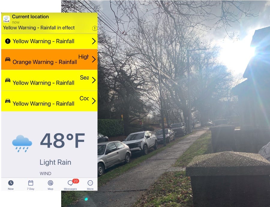
The forecast screen was swath of yellow. Some of those listed warnings were for other areas of the Lower Mainland and beyond, with little relevance to my need for a local weather report. Note how my “current location” - where I happened to be - is highlighted at the top with a yellow warning, meaning “hazardous weather” that “may cause damage, disruption, or health impacts.” Now see at the bottom: “light rain.”
To cap things off, it wasn’t even raining at the time, as indicated in the photo. Of course, the weather forecast is often inaccurate, sometimes even in real time—we all get that. Yet here’s one a bit harder to explain: a day later a friend sent me this screenshot of the weather app’s report from her area:
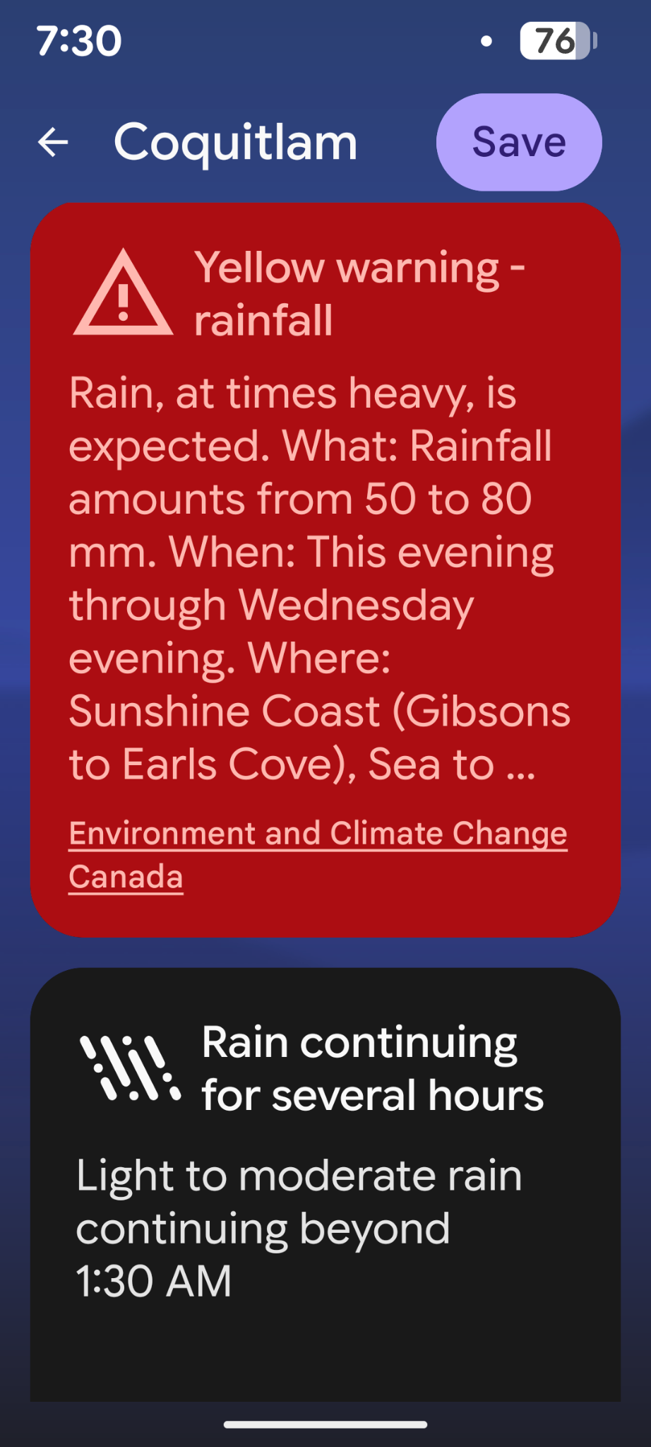
Note how it says “yellow warning,” yet the colour is red.
According to my friend, this wasn’t an accidental one-off. “OK, so this BIG RED SCARY WARNING has been coming up almost any day it’s raining,” she writes. “Ffs. It hasn’t been torrential or anything. Just normal winter rain. But we must remain SCARED!!!!”
Let’s not forget what red indicates to the meteorological mandarins at Environment Canada and Climate Change: ”very dangerous and possibly life-threatening weather, will cause extreme damage and disruption.”
Plus, in no conceivable universe is red equivalent to yellow.
To highlight the disconnect, here’s another weather warning for my area, also for Dec. 16. Again, my “current location” - where I happened to be - is highlighted at the top with yellow, and “light rain” indicated at the bottom. Same as my previous screen capture above.
Yellow warning, orange warning, yellow warning, yellow warning….light rain. It’s like a dad joke with an unfunny punchline.
What do any of these mixed messages accomplish other than encourage the perception that everyday weather is broken? (And no, I’m not talking about climate, a related but separate matter.)
Weather ain’t climate
The recently-launched colour-coded system “will make it easier to quickly understand the severity of extreme weather and its expected risk at a glance,” say the feds. It’s part of the ongoing weaponization —sorry, I mean modernization— of public weather forecasting and it “aligns with best practices worldwide, including those promoted by the World Meteorological Organization.”
For its part, the WMO states that its “guidelines promote impact-based forecasting with intuitive colours like yellow, amber/orange, and red to indicate escalating severity, helping national services convey threats to life, property, and disruption.”
In advancing this alert system, the WMO followed the example of the UK Met Office, which has been using this system since 2011.
The stated justification behind this colour-coding of forecasts involves climate change, of course. With the projection that extreme weather event events will rise in frequency with increasing CO2 emissions into the atmosphere, it seems reasonable to alert citizens with more attention-getting measures, no?
However, its easy to imagine these alerts accomplishing the opposite of the stated goal. When weather forecasts are peppered with too-frequent and unnecessary colour alerts right into the red, people are less likely to be spurred into appropriate preparation. They’re more likely to be desensitized. The end result: when something actually serious comes up, they’ve already tuned out the programming.
On top of that, Environment Canada and Climate Change already had extreme events covered with warnings emblazoned atop the weather reports. The new colour-coding is both confused and confusing. So perhaps there’s something else involved here beyond garden-variety bureaucratic idiocy?
“Don’t attribute to malice what can be explained by stupidity,” goes the saying. Sure, but either option looks pretty bad.
On the possibly stupid side, it wasn’t that long ago when climate scientists and media commentators were reasonably cautioning us that ‘weather is NOT climate.’ The former is made up of singular short-term events, while the other is a long-term atmospheric phenomenon. While they are connected, you can never directly equate isolated data points to a statistical ensemble indicating long-range trends. Have some experts, along with the weather service and the CBC, conveniently forgot that truism somewhere along the line?
I’m not arguing that extreme weather hasn’t increased, or won’t increase, over time. I’m simply repeating the previously accepted axiom that no single cyclone, storm, or flood - bad as it might be - cannot in itself be put down to extreme weather. And that remains the case whether you’re a ‘climate denialist’ or a ‘climate fantasist.’
(In other words, a stretch of unusually cool weather in one summer can no more be taken as falsification of climate change as a stretch of unusually hot weather can be taken as its verification.)
From forests to forecasts
While working on this article, I thought ‘where have I seen this colour alert system before? Oh yes, the “Homeland Security Advisory System,” a colour-coded terrorism threat scale created in March 2002 by the Bush administration. (I particularly like the “general risk of terror attacks” in blue.)
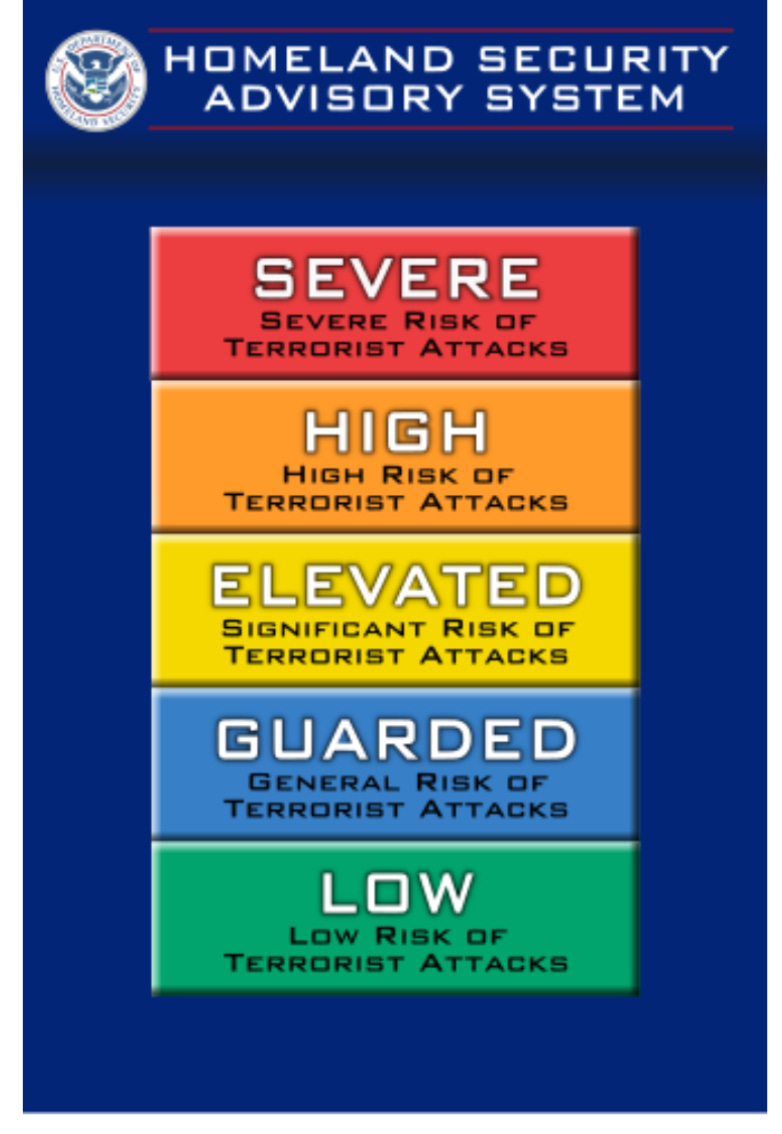
This advisory system probably wasn’t so much about keeping Americans safe as keeping them in a posture of fear, while the Cheney cabal went about building their case against Saddam Hussein, falsely connecting Iraq to Al Qaeda/ 9-11 prior to the 2003 invasion of the country. (Note how the colour-coded system for weather begins with yellow, the mid-point in the terror graphic above.)
And since we’re talking pedigree here, Homeland Security apparently drew upon the National Fire Danger Rating System (NFDRS) developed in the seventies.
I don’t imagine behavioural scientists were consulted by the architects of the NFDRS to keep campers out of tinder-dry forests. But in the making of colour-coded warnings for bad guys and bad weather? I’ll eat my tinfoil hat if they weren’t.
I not only get colour-coded weather warnings now on my iPhone, I also get updates telling me when a given alert is over. In other words, Environment Canada and Climate Change is informing Canadians when it’s safe to go outside again.
Signaling the public repeatedly that short-term weather is dangerous —even when it isn’t and won’t be—is a bit curious. It all fits in a bit too neatly with wider public concerns over the UN’s Agenda 2030, “15-Minute Cities,” and the spectre of social credit scores tied to individual carbon profiles.
Here’s my take. The ‘real owners’ know that to maintain a confused and compliant population of consumers, as workable as clay, damn near everything has to be pathologized into a syndrome, sickness, or threat. We’ve already seen legacy media pathologize rainfall into “atmospheric rivers,” storms into “bomb cyclones,” and winter cold into a “polar vortex.”
Can “extinction-level droughts” and “UV-apocalypse sunshine” be far behind? (I’m joking…for now. Satire tends to overtake reality within weeks to months these days.)
Oh well. At least it’s winter in these parts, so the heat can’t get us…for now.
Edward Bernays would be smiling. If you’re not familiar with Sigmund Freud’s cousin and the ‘father of public relations,’ you should be. His methods of mass persuasion have been significantly advanced and streamlined since his early 20th century reign. What has worked effectively in the past for manufacturing consent on everything from cigarettes to butter to politicians to wars continues to have applications beyond.
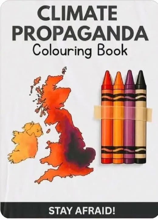
Okay, that’s enough on this topic. Some comic mind from the UK came up with this meme below, which seems the right note to close on. Stay scared, rubes!
.